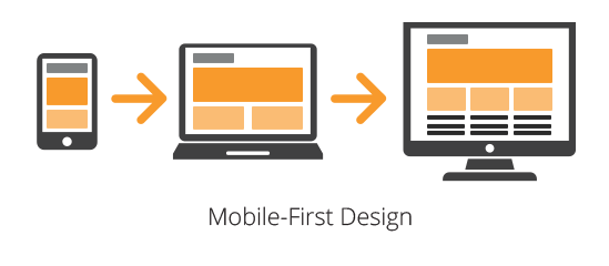
Mobile-first design is indispensable nowadays. The key reason for that is constant smartphone usage growth. With millions of users browsing the Internet primarily through their phones or tablets, software professionals must craft websites and applications with mobile screen capacities and limitations in mind. Foremost, this is beneficial for smartphone users, but business owners can also profit from such an approach. If customers can communicate with a company easily, this ensures audience growth, impressive ROI, and increased user satisfaction.
Let’s find out what mobile-first design means and how to implement it efficiently.
The Importance of This Approach
Web traffic has migrated to mobile devices on a massive scale. Statista predicts that the number of smartphone users worldwide will grow steadily from 2024 to 2029. A total growth will make up 1.5 billion users, or 30.6%. By 2029, the estimated number will reach a new peak of 6.4 billion.
These figures prove that embracing a mobile-first philosophy has become essential. Modern people cherish flexibility and want it—even when reading or listening to music. Nowadays, no one is surprised to see a person watching a movie on their smartphone on a train. So, IT professionals create products optimized for the way most users access the web.
Below are the most convincing reasons why this approach is a priority in product development and not an afterthought.
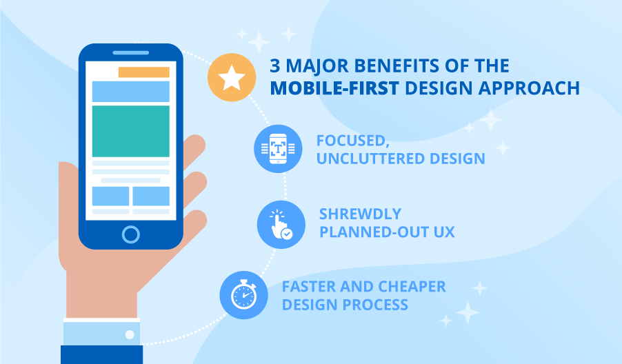
1. People who browse the web via smartphones have distinct needs and limitations that influence their experience. These are, naturally, smaller screens, touch-based interfaces, limited processing power, and unstable connectivity. If designers consider these constraints, people will enjoy more comfortable software experiences. Progressive enhancement and responsive techniques allow vital content to be delivered on phones while adding extra features as the capacities of a device increase.
2. Modern search engines prioritize mobile-friendly sites, so this approach can boost search rankings and organic traffic. And because UX needs to be distilled to essentials, they force a streamlined design.
3. Enhancing digital products for phones enables true responsive design where UI seamlessly adapts across screen sizes and touchpoints. This secures a unified UX that helps people transition between devices easily.
4. Finally, with phones being the most important touchpoint for most people today, embracing this approach positively influences conversion rates, engagement metrics, and overall user satisfaction. This ensures that businesses adapt to users’ needs by providing a comfortable experience on their preferred platforms.
In short, embracing this philosophy is a sensible decision given the current digital environment. Companies can secure exceptional software experiences, beat the competition, and satisfy customers across touchpoints.
Connecting Mobile-first, Responsive, and Progressive Design
Every specialist in digital product development is familiar with strategies that enable the creation of optimal software solutions. Depending on the context and software goals, IT professionals employ each of them. In this way, they ensure ideal experiences in various scenarios:
- Mobile-first places the needs of mobile users as the top priority.
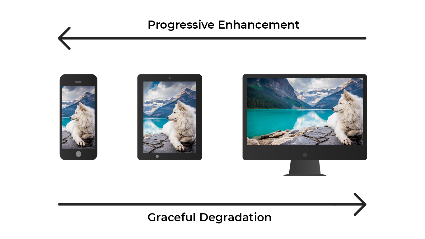
- Responsive design is a technical implementation that allows flexible resizing across viewports.
- Progressive enhancement moves on from content to enrichment—optimizing functionality for all while adding advanced features for capable browsers.
- Graceful degradation offers full functionality for modern browsers while retaining accessibility for less advanced ones.
Mobile-first and responsive design work well together—responsive techniques bring impeccable experiences to life, no matter the size of a screen. Progressive enhancement complements this by ensuring core content is accessible on any device before adding advanced features. Graceful degradation shares this content-first mentality but approaches from the most advanced browser experience.
A mobile-first mindset is a driving force behind the strategy. Responsive techniques enable adaptability in various situations. Progressive enhancement highlights the content, enhancing incrementally. Together, these intersecting philosophies allow professionals to create optimized, accessible solutions that meet users wherever they are.
IT professionals use these ideas to create digital solutions that deliver essential experiences, no matter the device. Whenever they can, experts incorporate extra features. This inclusive strategy is crucial nowadays.
Key Principles to Be Aware Of
To fully adopt a mobile-centric mindset, designers need to adjust their thinking to create experiences tailored specifically for handheld devices. This involves prioritizing certain principles:
Reduce, don’t reproduce. There are so many interesting features one might add to a page, but if it is overloaded, this might irritate visitors. In the case of smartphones, it’s grave—no one wants to use a magnifying glass when looking for certain details. That’s why cramming desktop content onto a smaller screen is out of the question. Instead, specialists working on digital products identify the bare essentials for mobile usage and implement them. This means streamlining navigation, minimizing interface elements, and emphasizing scannable, concise copy.
Harness the potential of touch. With tapped and swiped interactions, mobile unlocks new possibilities for intuitive interfaces. That’s why designing for fingertips with generous tap targets is a must. Users would prefer gestures they already know. Specialists also avoid including hover-dependent features.
Mobile is content-first. Important copy must be visually prioritized through typographic hierarchies, succinct paragraphs, and strategic whitespace. Layouts should be structured in such a way that they determine the viewing order and highlight critical information first.
Every pixel counts. As space is limited, layouts must be carefully crafted, with each element taking its place. This includes optimized images, combined interface elements, and white space helping to avoid clutter.
Emphasize usefulness. Mobile interactions often serve specific user needs at a particular moment. Identifying them must be a top goal. Any person must be able to accomplish key tasks easily on the go.
By incorporating these principles, designers can develop mobile products that feel custom-made for handheld usage, rather than merely scaled-down versions of desktop sites. The limited screen space necessitates a specialized strategy to produce intuitive and focused experiences.

Bringing the Mobile-first Concept to Reality
To adopt this strategy, you must reassess procedures in design and development. By following a few key steps, you can effectively shift to mobile-oriented thinking.
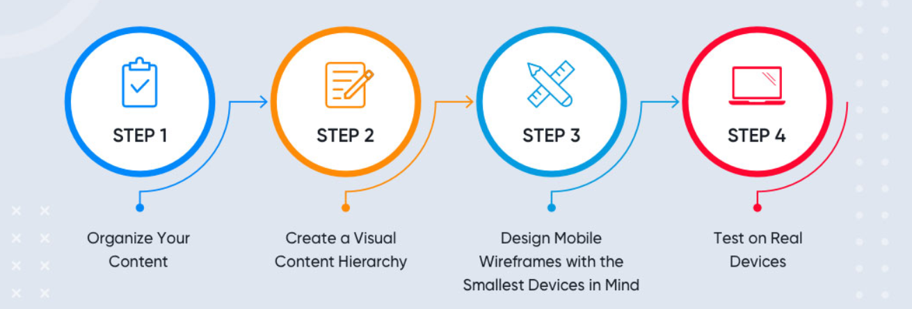
Begin with structure and content
Start by conducting a content audit and organizing it according to mobile user priority. Maintain a spreadsheet mapping all elements and how they support key user tasks. This guarantees an organized inventory that can guide decision-making. Streamline and optimize copy length, emphasizing scannable formatting like bulleted lists.
Map the information architecture
With core content defined, map out site architecture and navigation (don’t forget to optimize them for smartphones). Limit primary navigation to 3–7 high-priority items. Secondary menus should adapt to context. Ensure critical pages are accessible within 1–2 taps from the homepage. Improve way-finding by implementing breadcrumbs and linking to related content.
Build wireframes
With the architecture set, blueprint the mobile experience through low-fidelity wireframes. Map layout and interactions to maximize efficiency. Create preliminary sketches emphasizing the organization of content, logical progression, and essential features. Verify your ideas through user testing on mobile. Make revisions based on feedback before creating the visual design.
Craft visuals for phone usage
With wireframes confirmed, craft the visual experience natively for smartphones. Interfaces must be purpose-built for touch, with optimized buttons and taps for fingers. Size, place, and space elements appropriate for the smaller canvas. Develop modular, flexible components that adapt across breakpoints. Limit large, high-resolution graphics.
Code with progressive enhancement
Use progressive enhancement and the philosophy of responsiveness when building. Develop code for the tiniest screens, focusing on content and features. Then layer in enhancements like richer interactions, motion, and bigger graphics as the screen size increases. Maintain performance by enhancing image capacities and caching. Continuously test on actual mobile devices.
Constantly optimize based on data
Track analytics to pinpoint chances for enhancing the mobile user experience. Conduct A/B tests concentrating on engagement and conversions. Pay attention to user input and app store evaluations. Establish monitoring to detect mobile-specific challenges. Integrate enhancements such as gesture assistance and app deep linking gradually.
By following an appropriate workflow, you can create mobile experiences that seamlessly integrate, rather than appear as an afterthought. Consistently embracing a mobile-first approach during the design and development process is essential for crafting digital products that align with contemporary web usage patterns.
Conclusion
As you see, mobile-first design is indispensable for businesses aiming for user acclaim and satisfaction. No matter the company type—a bar, a spa, or a clinic—people increasingly prefer to book services online, often using smartphones. Therefore, when developing or updating software, IT experts must ensure mobile friendliness. Following this method results in better search rankings and enhanced usability. It is no longer a choice but a necessity to have inclusive, optimized experiences on all devices.