What Are Lead Capture Pages? Top Examples
Guest Entry by Digital Gratified.
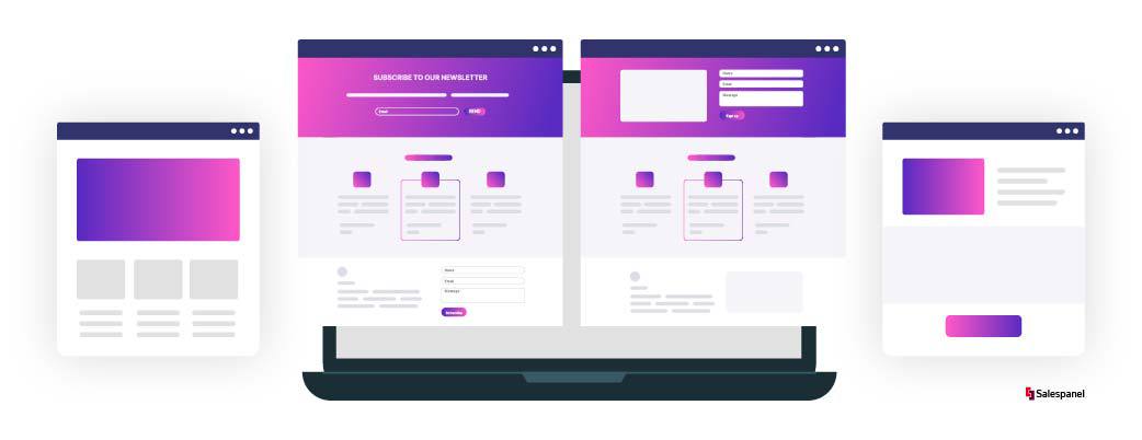
While running a marketing campaign, it is crucial to decide where you are going to send your leads. You might be sending them to the homepage or subdomain on the homepage. But, if you do not have separate lead capture pages, you are missing out on some serious opportunities.
Homepages are supposed to be the information hub of your company, the encyclopedia where visitors can get every information they need about your business to move forward. When you send your leads to the homepage, it might get confusing and overwhelming for them since they are only looking for specific information, and there is a lot more than that. This is where lead capture pages come into the picture.
Unlike the homepage, lead capture pages have only one end goal. These pages are supposed to provide information to the customers, take care of the relationship between your potential customers and your business to get you more leads. Let’s understand what lead capture pages are in detail.
What Are Lead Capture Pages? How Do They Help?
The lead capture pages can be considered as subsets of landing pages, and sometimes it is also referred to as the destination page of the website. As the name suggests, the sole purpose of these landing pages is to capture leads. Usually, lead capture pages are quite different from the general website or any other webpage of the company. The primary objective of this page is to make the users perform a single actionable task. The task can be anything from signing up for a newsletter to making a purchase from the company’s website.
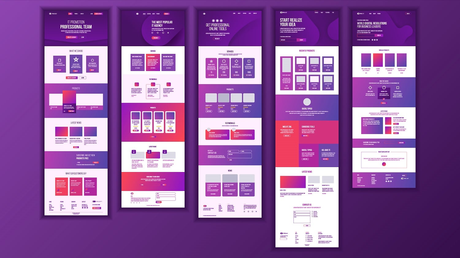
For the marketing efforts, every company tries using lead capture pages in their website and overall online presence. Whenever a user clicks on some PPC ad or some email promotion link, they are led to a lead capture page. This lead capture page will then be responsible for making the conversion process streamlined. This gives companies the ability to segment the traffic and then display the right information in front of the right audience.
The purpose of the lead capture pages is plain and simple – to convert. This is exactly why these pages are simple and do not have information that can distract the visitors. There are many lead capture pages that do not even have buttons to navigate to another page. This allows visitors to focus completely on the lead capture page function.
When you have something valuable for your visitors, these lead capture pages can turn out to be very helpful by collecting the relevant information of users in return for what you are providing. These pages help you in introducing newer prospects quickly to your marketing funnel.
Now that we know what lead capture pages are and how they help your business let’s know more about how you can use these pages for various purposes.
Optimizing Capture Pages
Sure, a lead capture page can generate great results for your marketing team, but for it to happen, you must ensure that the pages are optimized properly. A well-optimized lead capture page allows you as a marketer to gunner leads from your offers and then nurture them down to your marketing funnel easily.
If you want the lead capture page to work successfully, ensure that the balance of reward and ask is maintained properly. The ask here is the form fields that you want your visitors to fill out, and the reward is what they get in return for filling the information.
People will only be enticed to fill the lead capture form when the information asked is relevant. At no point, a visitor should feel uncomfortable while filling the form. Let’s get into some ways you can optimise your lead capture page for better performance:
Design
Design is one of the most crucial aspects for not just lead capture pages but for any form of online page. It is the design that can dangle a carrot in front of your visitors to take the actions that you desire. This is why the experts say that the design of the lead capture page should be based on conversion-centred design principles.
When your lead capture page is based on conversion-centred design principles, it means that every aspect of your page, be it an ad or a form, is thoughtfully placed. They help in guiding your customers towards conversion and retention.
The conversion-centred design is affected by three major aspects of design: consistency, simplicity, and credibility.
Consistency:
It is essential to ensure that your visitors get all the information they need to make a well-informed decision. Your messaging, copy and design needs to maintain a seamless flow right from the pre-click (ad, social media post, or emails) to post-click (the lead capture page).
Simplicity:
If you want to see a higher conversion rate, it is essential that you focus only on one goal. Many companies have the first-hand experience of this. For example, a company named Unbounce increased visits to the next page by 172.1% just by eliminating all the distractions.
Credibility:
It is essential that customers see you as a credible business. In order to achieve this, you need to show as many sources of credibility as you can. Certificates, reviews, privacy policies are some of the effective elements to convey how trustworthy your business is. For that, go ahead with adding video testimonials as visitors prefer seeing the short customer video testimonials rather than reading long texts speaking about their experience with your organization. That real human eye-to-eye interaction where visitors get to see and feel the emotions of others who already are working with you or worked with you can do wonders for your lead conversion.
Search Engine Optimization (SEO)
While lead capture pages are completely different from the homepage, they can still function as any other page on your website. This makes it extremely crucial for you to take care of the search engine optimisation (SEO) part. To earn organic traffic and conversions, you should create an optimised experience and offer for your visitors. Check website ranking to make informed decisions for your SEO strategy.
To optimise your lead capture pages for SEO, you should:
- Strategise how and where you add the keywords
- Make the pages mobile-friendly
- Ensure that you put relevant, reliable, and trustworthy content
- Focus on the user experience of the page
- Use relevant meta descriptions and title tags
Load Speed:
When people visit your landing page or lead capture page, it means that they are interested in your business. However, people always feel that they are being targeted with sales which build pressure.
Every second delay in loading the page would mean that you lose 7% of your conversion rate. On top of this, around 37% of the visitors bounce when your site takes more than five seconds to load. How fast your lead capture page loads is directly associated with how usable and successful it is.
Follow these steps to optimise your website for speed:
- Use the image of small size without compromising the speed of the page
- Don’t use unnecessary plugins on your website
- Use minimal CSS and JavaScript codes
- If the website is still loading slowly after all this, consider finding a better host.
CTAs:
CTAs are the most important aspect of your lead generation page because it influences people to take actions. You must ensure that the Call to action (CTA) button is alluring enough to your potential customers to encourage them to make a click. Some of the things that your CTA button must have is:
- The CTA must have a personalised copy
- Its size should be big enough to catch the attention of your users
- The colour of the CTA button should be contrasting to the rest of the landing page so that it can stand out properly.
Examples of Lead Capture Pages
Now that we know what lead capture pages are and how to work on optimising them. Let’s look at the three best examples to help create one for your own:
TransferWise’s Currency Calculator
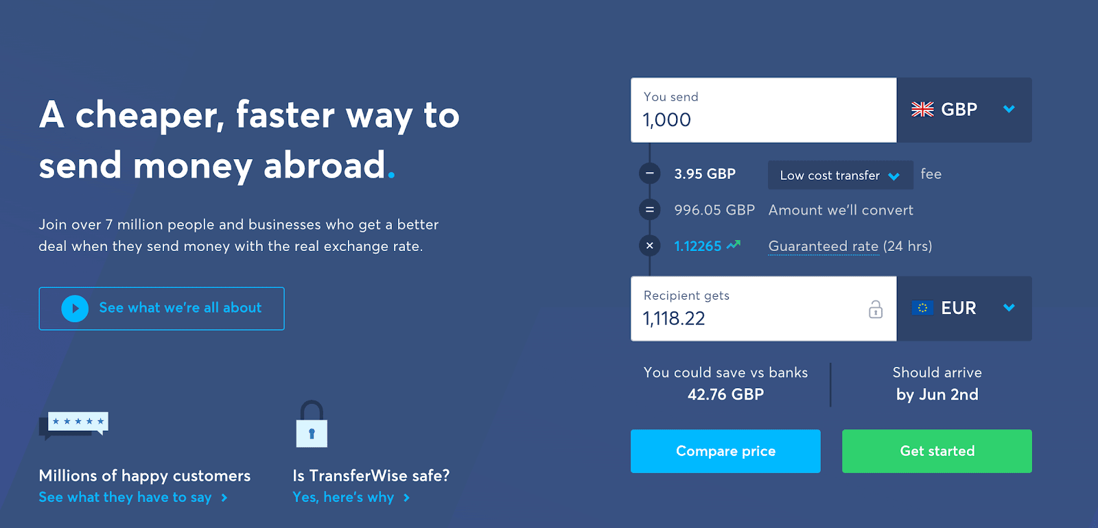
It is well-known that a good lead capture page should always have some value to your audience. But it is not necessary to always hide the value behind some lead capture form.
Take TransferWise as an example. The USP of Transwise is the fact that it’s cheaper for their customers to convert and then transfer money in different currencies. So, they have a converter for the currency on their lead capture page. It also has a “get started” button to lead people towards their signup page.
Codecademy’s “get started” form
As we’ve mentioned above, social proof and testimonials are crucial for lead capture pages. Your visitors must know that your brand is trustworthy before they hand over their email addresses to you. You can convince your visitors about this by showing them the number of people who’ve done it already.
This is not complex at all. The lead capture page of Codecademy has a simple headline that says, optimized “join the millions learning to code with Codecademy.” This gives the visitors the confidence to sign up.

ConvertKit’s Workshop Lead Capture Page
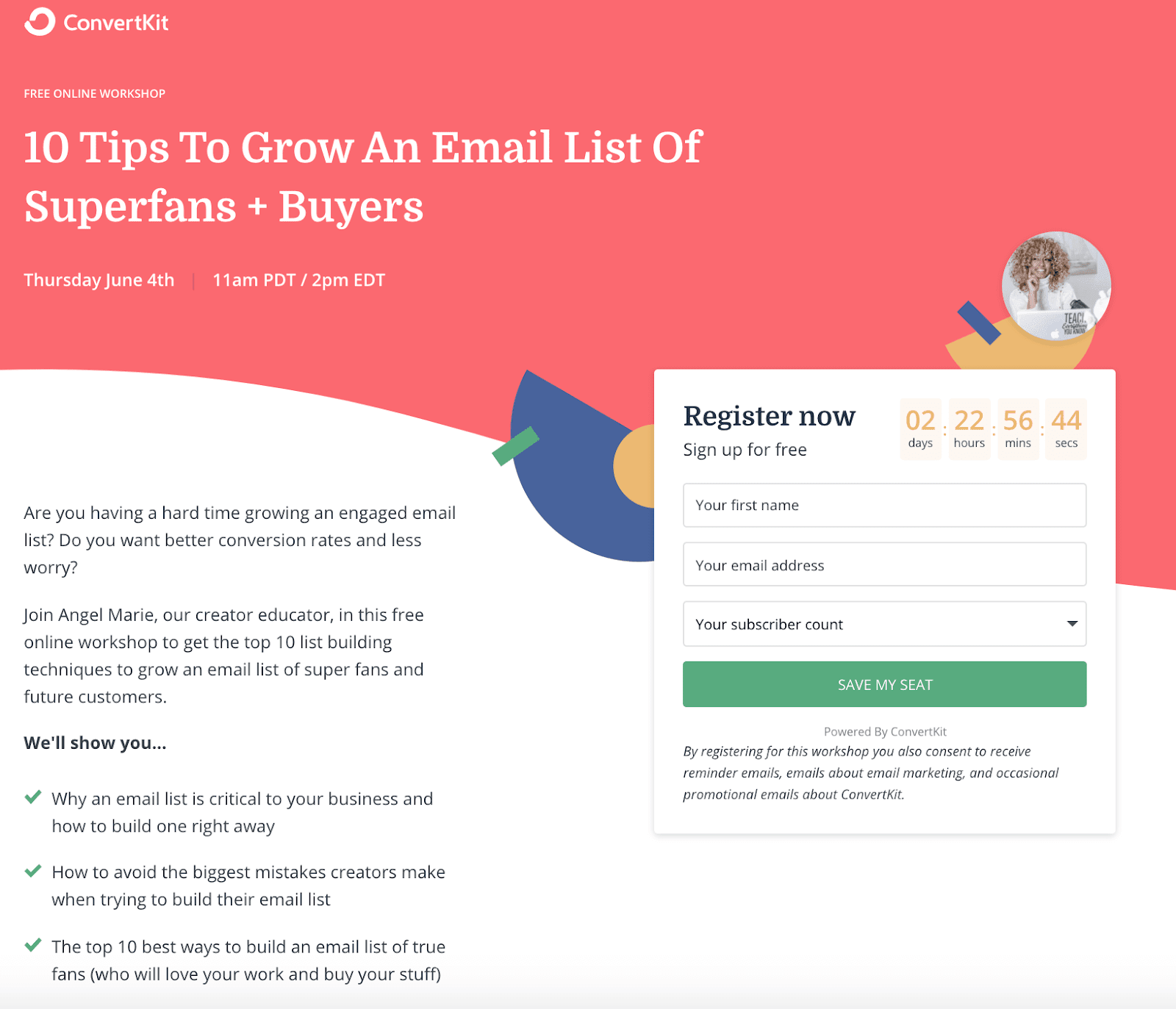
The landing page that you use for your webinars can be used as a lead capture page too. Here’s an example of ConvertKit that has a perfectly branded sign-up page. The time and date are well-placed alongside a basic form with a “save my seat” CTA.
Other than this, it not only asks for your email address but also your name and subscriber count. Using these two fields, ConvertKit can send you personalised emails and content you’d find useful based on your subscriber count.
Final Thoughts
There’s no doubt that generating high-quality leads is a demanding task. It is because most of the visitors shy away from taking the second step to engage further with the company. However, we have how effective lead capture pages can be if designed and appropriately optimised. You can exponentially increase the conversation rate by spending some time and putting some thought into the practicality of the lead capture pages.
Sell more, understand your customers’ journey for free!
Sales and Marketing teams spend millions of dollars to bring visitors to your website. But do you track your customer’s journey? Do you know who buys and why?
Around 8% of your website traffic will sign up on your lead forms. What happens to the other 92% of your traffic? Can you identify your visiting accounts? Can you engage and retarget your qualified visitors even if they are not identified?

