Top 7 Best Practices for B2B Landing Pages in 2026 and beyond
Early in digital marketing, a landing page was a simple digital handshake providing a headline, a form, and waiting. Now, the strategic ground has seismically shifted. Though the average landing page conversion rate is 2.35%, the top 10% of landing pages boast conversions of 11.45% and higher. This vast gap is not accidental but the direct result of a profound evolution in strategy, psychology, and technology.
What was once effective, like using vague stock photos and promises, has changed. Today’s sophisticated B2B buyers demand clarity and value. The pages that convert are not just persuasive but predictive, and they don’t just provide information but are personalized for the user. A landing page has to be a precision instrument, designed to lead a particular audience segment to a singular, significant action. This guide’s main point is the systematic elimination of friction—the technical and psychological barriers for the landing page visitor must be handled.
This piece dissects the core technical and strategic frameworks that differentiate top achievers from their peers. Each strategy helps in smoothing the pathway to achieving conversions. We will discuss the structural strategies that instill confidence, optimize for speed, and direct users to take an action.
Principle 1: Architecting a Bulletproof Value Proposition Above the Fold

The most critical element of any B2B landing page is the value proposition, and keep it “above the fold.” A value proposition is not just a catchy slogan, and it is not a mission statement in the traditional sense. A value proposition is supposed to address the most common concern of a prospective customer, a technical articulation of value that must immediately answer the question: “What tangible outcome will I get from this, and why is it better than the alternatives?” A value proposition has less than five seconds to address those concerns before the visitor bounces.
A weak value proposition is the leading cause of high bounce rates and low conversion rates. On the other hand, the value proposition is supposed to act as the foundational pillar for the entire page, framing every subsequent element from the call-to-action to the social proof. The value proposition sets the tone for the page, and it guides the calls to action, the social proof, and all the other page elements. It must be engineered to resonate instantly with your ideal customer profile (ICP).
The Four Pillars of a High-Converting Value Proposition
A technically sound value proposition is a concise synthesis of four distinct components. If any one of them is omitted, the proposition’s structural integrity is compromised, and the value proposition fails. Your proposition must communicate:
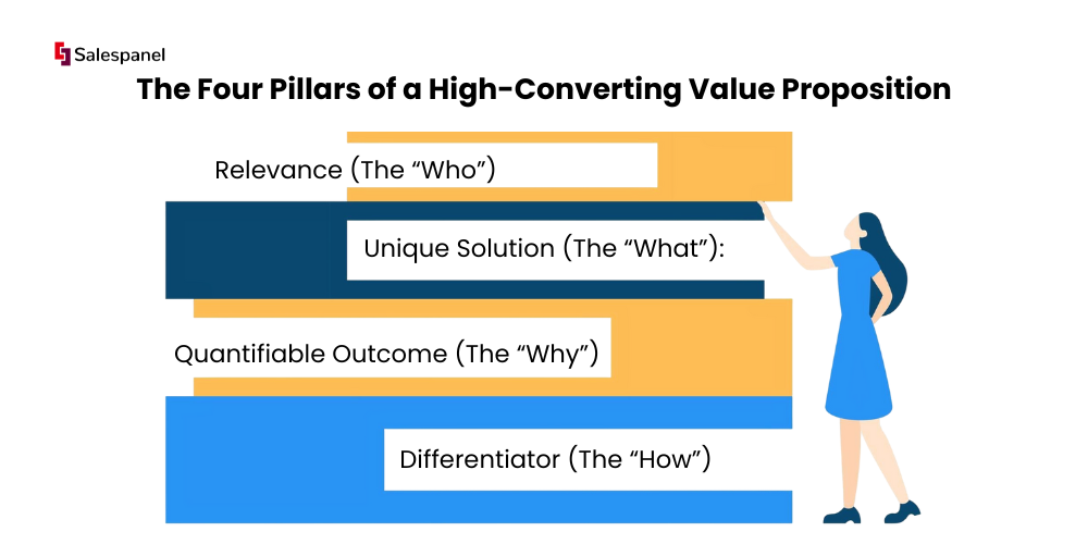
- Relevance (The “Who”): Explicitly identify the target audience and their critical pain point.
Example: For B2B marketing teams who find it difficult to deal with anonymous website traffic. - Unique Solution (The “What”): State how your service or product solves that problem.
Example: Our platform de-anonymizes visitors and tracks their buying journey. - Quantifiable Outcome (The “Why”): Make a clear statement about the value the client gets, and be sure to mention what it is and how it is measurable.
Example: Allowing you to discover 50% more qualified leads. - Differentiator (The “How”): State briefly how the solution outperforms alternatives, and what makes it superior.
Example: By using a proprietary real-time data enrichment engine that your competitors do not have.
Key Takeaway: Value propositions don’t come down to just a headline. A complete value proposition takes the form of a headline, a sub-head, and a few bullets, and this value proposition integrates all four pillars succinctly and clearly.
Practical Implementation: From Theory to Action
Take Asana, for example. Their landing page marketing copy sometimes states, “The best platform for cross-functional work.” This is accompanied by, “See, plan, and scale your team’s projects from start to finish.” This addresses the pain point of disorganized cross-team collaboration (Relevance), presents Asana as the fix (Solution), implies the benefit of efficiency and control (Outcome), and claims to be “the best” (Point of difference).
To architect your own, start by interviewing your best customers. Ask them to describe your product in their own words and pinpoint the single most significant result they’ve achieved. Use their language to craft a value proposition that is authentic, specific, and laser-focused on outcomes. This is one of the most vital best practices for landing pages because it directly impacts whether a visitor stays to learn more or leaves immediately.
Principle 2: Engineering a Single, Clear Call-to-Action (CTA)

Once you have a compelling value proposition, the next step is to have a singular, unambiguous Call-to-Action (CTA). A landing page is not a website homepage—it is a purpose-built conversion machine with one job. If you have multiple CTAs, such as “Request a Demo,” “Download Whitepaper,” and “Start a Trial,” it creates decision paralysis, dilutes focus, and catastrophically lowers conversion rates.
The function of the CTA is to be the +6
conclusion of the value proposition you offered. It must provide a clear, low-friction path for the visitor to take the one specific action you want. If a CTA is poorly defined or competing, it is the digital equivalent of a salesperson asking a prospect if they want to buy, get more information, or just think about it, all in the same breath. It confuses the user and breaks the conversion funnel.
The Four Tenets of a High-Impact CTA
A technically optimized CTA is designed for clarity, motivation, and action. It is more than an ordinary “Submit” button, as it incorporates psychological triggers that guide the user’s decision-making process. For this reason, your primary CTA should embody these four tenets:
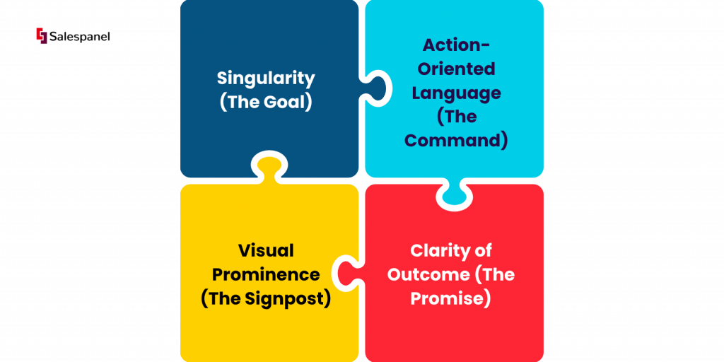
- Singularity (The Goal): The page must be laser-focused on a single conversion goal. Every element should funnel the visitor toward this one action, from the headlines to the page copy.
- Action-Oriented Language (The Command): Use strong verbs and benefit-driven phrases. For example, passive copy like “Submit” should be replaced by action-oriented commands that promise some positive outcome, like “Get My Free Demo” or “Unlock My Report.”
- Visual Prominence (The Signpost): The CTA button should be impossible not to notice. Use contrasting colors, ample white space, and a size that is easily tappable on mobile devices to make it the focal point of the page.
- Clarity of Outcome (The Promise): The outcome must be clear. For example, “Get Free Tools” is more straightforward than “Download” because it explicitly states the value exchange and removes ambiguity.
Key Takeaway: The best CTAs usually feature first-person possessive language (i.e., “my,” “me”). “Start your free trial” vs “Start my free trial” is widely A/B tested and proven to have a stronger link in psychological closeness, thus increasing CTRs.
Practical Implementation: From Theory to Action
Consider the B2B SaaS company Dropbox. Remember how they presented the “Try Dropbox Business free for 30 days” copy on their landing pages. This is a masterclass in CTA design. The copy is action-oriented, risk-reducing, and action-oriented. The copy tells prospective customers exactly what they’ll receive, completely free for 30 days, which is the length of time they’ll receive the service.
The first thing you need to do is define the one most important action a visitor could do that aligns with the goals of your campaign. Think of how you could craft your CTA to reflect what value they’ll get instead of what action they’ll perform. Rather than “Subscribe,” use “Get Weekly B2B Insights.” This small change reframes the action from a commitment to a benefit. This is one of the most crucial best practices for landing pages and landing page design to help bridge the gap from interest to conversion.
Principle 3: Engineering a Mobile-First Experience
Today, adopting a desktop-centric design philosophy in B2B marketing is a critical strategic error. It is wrong to think that mobile-first design just means making a desktop page shrink to fit a smaller screen. That would still be desktop-first. A mobile-first design means designing for the smallest screen (mobile) and designing for larger tablets and desktops as the screen size increases. Since most users do preliminary B2B research and engage with emails on mobile devices, a seamless mobile experience is a non-negotiable component of a high-performing landing page.
A failure to adopt a mobile-first approach directly translates into a poor user experience. leading to higher bounce rates. Diminished brand perception and, most importantly, reduced conversions. With Google’s mobile-first indexing, for sites with mobile versions, the mobile site determines search ranking, making it one of the most vital best practices for landing pages for user engagement and organic search visibility. This best practice is key to eliminating the friction of inaccessibility.
The Core Tenets of Mobile-First Architecture
Constructing a mobile-first landing page requires deliberate constraints and a focused user experience. This architecture forces you to prioritize on what you need to convert; the result is a cleaner, faster, and more effective page on all devices. This approach is built on the following tenets:

- Content Prioritization: The limited screen real estate of a mobile device forces you to ruthlessly prioritize your content. Identify the most important information that should be featured: the value proposition, the primary call-to-action, and the key benefits. Everything else is secondary, and you can push it down or cut it entirely.
- Performance Optimization: Mobile users have less patience for slow load times. With a mobile-first approach to design, you can prioritize performance by default. Use compressed images, efficient code, and minimized scripts to guarantee mobile-first pages open within seconds, even on poor internet connections.
- Touch-Centric Navigation: Design elements for touches rather than for a mouse pointer. This involves creating large tappable buttons (a minimum of 44×44 pixels is a standard guideline), providing adequate spacing to avoid mis-taps, and designing thumb-friendly navigation for one-handed operation.
- Simplified Forms: Complicated and lengthy forms easily frustrate mobile users. With a mobile-first design, forms must be simplified to the absolute essentials. Best practices are single-column layouts, clearly labeled fields, and mobile-friendly input types (e.g., a number pad for phone numbers).
Key Takeaway: Adopting a mobile-first approach is not purely a technical decision; it is a strategic one. Understanding the mobile user’s limited surroundings forces you to create a more streamlined, productive, and conversion-friendly experience for all users, including desktop users.
Practical Implementation: From Theory to Action
Consider the user experience on Airbnb’s mobile site. The search and booking flow has been stripped down to its essential components. The primary CTA, “Search,” is prominent. Users can easily select booking dates. Filter options are accessible but not overwhelming. This is a masterclass in mobile-first execution, as the site design focuses on removing all potential friction for the on-the-go user.
Begin your design process in a mobile-sized viewport (e.g., 375×667 pixels). Wireframe the most critical user journey first, i.e., how visitors perceive the offer and complete the primary goal on their mobile device. It is critical to test your prototypes on actual mobile devices, not just browser emulators, because you have to get a true feel for tap targets and readability. This disciplined approach ensures your landing page is engineered for the modern B2B buyer’s journey, which almost always begins or includes a mobile touchpoint.
Once you build a strong value proposition, the next important step is to neutralize the visitor’s inherent skepticism. B2B buyers are risk-averse because they want validation that your solution is effective and that it is a safe and credible choice. Social proof is the psychological mechanism that provides this validation; it shows that others, especially respected peers, have successfully used your solution.

Without those signals, your statements will remain as just that, statements. When you show tangible proof from existing customers and recognized third parties, you show that your landing page is not a sales pitch, but a trusted resource. This change is vital for taking a prospect from the first stages of interest to a confirmed conversion, and is the best way to remove the friction of doubt.
A robust social proof strategy requires having a diverse portfolio of evidence. Just having one type of proof is too limiting. A multi-faceted approach addresses different dimensions of a buyer’s need for validation when are thinking about making a purchase. Social proof should have:
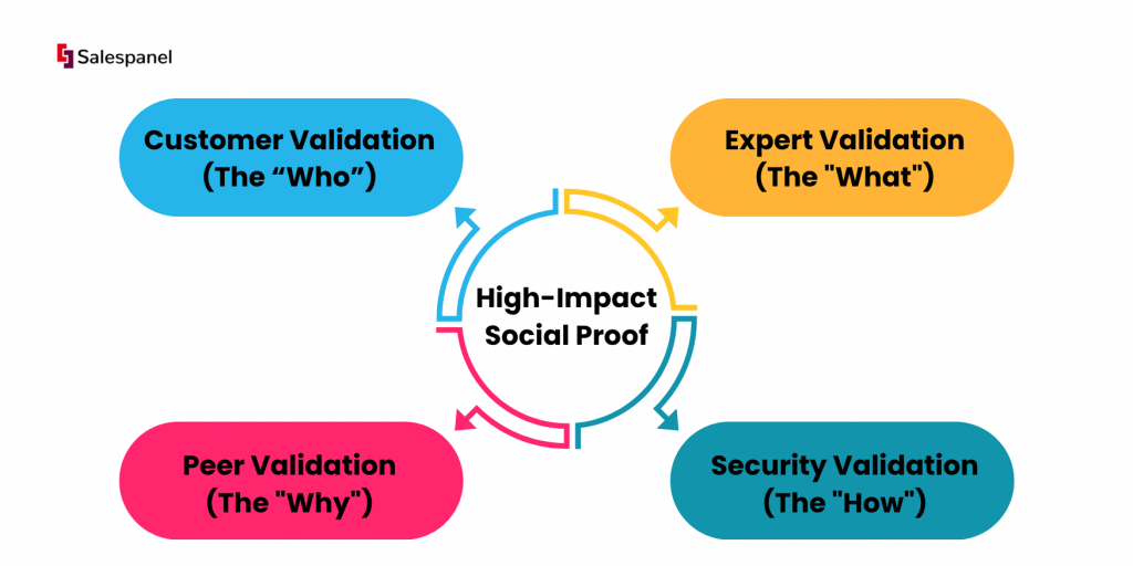
- Customer Validation (The “Who”): Use client testimonials, case studies, and client reviews. This answers the “Have people like me succeeded with this?” question. This can be something like, “Working with them has been a game-changer for our team,” quoted as a Marketing Director for a well-known tech company. Picture and title included. This works.
- Expert Validation (The “What”): Use endorsements, awards, and mentions of you or your company in leading publications. This answers the question, “Is this solution respected by experts in the field?” This can be placing the “G2 High Performer” badge on the page.
- Peer Validation (The “Why”): Use the “wisdom of the crowds” technique by displaying logos of well-known customers or user counts. This shows the scale and market acceptance and addresses the question, “Is this solution popular and widely used?” For example, “Used by more than 10,000 marketing teams across the globe.”
- Security Validation (The “How”): Use trust badges for security certifications (SOC 2, ISO), privacy compliance (GDPR), and secure payment icons. This explains to users that their data and transactions are secure. For example, a Norton Secured seal displayed close to the form submission button reinforces trust effectively
Key Takeaway: The best social proof available comes in specific and quantifiable. A testimonial that states, “We increased qualified leads by 45% in Q2” is exponentially more impactful than one that states, “Great product!”
Practical Implementation: From Theory to Action
Basecamp serves as a project management tool for small and large businesses. Their website features a “client wall” showcasing the logos of major companies like NASA and 3 M. Right after, there are detailed testimonials from small business owners about the operational problems Basecamp solved for them. This combination of peer validation (big-name clients) and customer validation (relatable stories) is a masterclass in building trust.
Begin by systematically collecting customer feedback. Set up automated post-onboarding surveys to request reviews and identify potential candidates for case studies. Ask them for detailed success stories. The surveys take between 15 and 25 minutes to complete. For testimonials, always ask for permission to use the customer’s full name, title, and company. Pictures and detailed client stories, as well as the name and title of the customer, are specific and attributable proof that carries more weight.
Principle 5: Implementing a Minimal and Focused Design

In a B2B context where clarity trumps creativity, a minimal and focused design is a conversion-focused engineering decision. This indicates that every element on your landing page must serve a single, unified purpose, steering the visitor to your conversion objective. By systematically removing unnecessary navigation, visual clutter, and extraneous information, you help the visitor by reducing cognitive load and eliminating decision fatigue to create a frictionless path to the call-to-action.
A cluttered and messy page contains competing messages and pathways that reduce the chances of conversion. On the other hand, a minimalist design will use negative space and a strict visual hierarchy to direct attention to precisely where you want it. This allows the value proposition and CTA to take center stage and ensures there is no distraction or friction to accessing the content provided.
The Core Tenets of High-Conversion Minimalism
Adjusting to minimalism does not mean your design will be empty, only purposeful. The best designs carefully consider every pixel to determine success. The following principles will uphold your efforts in minimalism.

- Purposeful Element Inclusion: Every headline, image, form field, and button directly supports the conversion goal. If it does not persuade, clarify, or help the user take the action, then it should be gotten rid of.
- Strategic Use of White Space: White space is not empty nothingness; it is actively used to minimize less important things in a design. White space can be used to surround the most important elements, like the CTA and your proposition.
- Controlled Visual Hierarchy: Gaze control is important in a design. Create a hierarchy of importance, starting from the headline, followed by the proposition, then social proof, and lastly the call to action. Use size, color, and placement in a predictable order to form a complete visual hierarchy.
- Elimination of Distractions: The most common distraction is the main navigation of the website. It gives users the ability to freely click away from a landing page. Removing navigation from a landing page can increase conversions as it traps the visitor’s focus and prevents them from clicking away.
Key Takeaway: Minimalist design is all about the signal-to-noise ratio. A high-converting landing page maximizes the signal (the value proposition and CTA) and minimizes the noise (everything that distracts from the core message).
Practical Implementation: From Theory to Action
Take a look at the landing pages for all Apple products – they utilize vast amounts of white space, a single hero image of the Apple product, a concise headline, and a clear “Buy” or “Learn More” button. There are no distracting sidebars or convoluted menus. This deliberate simplicity communicates confidence, focuses the user entirely on the product’s value and the next step, and what the user what should do next.
To implement this, start by auditing your existing landing pages. For every element, ask, “Does this help the visitor take the next step and click on the CTA?” If the answer is no, try taking it away. One of the critical best practices for landing pages is to ruthlessly remove any component that does not serve the page’s one and only goal. For example, remove the main navigation menu and observe the immediate impact on your conversion metrics.
Principle 6: Engineering Sub-Three-Second Loading Speeds
In the B2B digital ecosystem, speed is not a feature; it’s a prerequisite for engagement. A visitor’s patience is measured in milliseconds, and the speed with which pages load becomes a critical, non-negotiable technical requirement. Research has consistently demonstrated that even a one-second delay in page load time can result in a 7% reduction in conversions, which directly impacts lead generation pipelines and revenue. Slow pages kill conversions before your value proposition is ever seen.

Failing to prioritize speed optimization means you are actively choosing to leak qualified leads. Page loading speed is a user experience best practice, significantly reduces bounce rates, and is a confirmed ranking factor for search engines like Google. For B2B marketers, a faster page not only converts better but also earns more organic visibility, creating a powerful flywheel effect, significantly improving the page’s visibility in search results. This is also one of the most fundamental best practices for landing pages, as it respects the visitor’s time and eliminates the friction of waiting.
The Four Pillars of High-Performance Page Loading
When it comes to speed optimization, a technically sound approach focuses on four key areas of improvement. Ignoring any of these will create a bottleneck that undermines the performance of the entire page, no matter how well optimized everything else is.

- Asset Optimization (The “Weight”): Reduce the file size of all page assets, especially images, which are often the heaviest components. Example: Compressing a 1MB hero image to a 150KB WebP file without perceptible quality loss.
- Code Minification (The “Code”): Eliminate unnecessary characters from your HTML, CSS, and JavaScript files. This includes removing white space, comments, and line breaks. An example would be using an automated tool to minify a 50KB CSS file down to 35KB.
- Request Management (The “Requests”): This involves limiting the number of HTTP requests your browser has to make to render the page. Each script, stylesheet, and image counts as an individual request. For example, you can combine multiple CSS files into a single file and limit third-party tracking scripts.
- Server Response (The “Server”): Ensure the server responds quickly to the initial browser request. This is influenced by hosting quality and geographic distance. Using a Content Delivery Network (CDN) to serve assets from a location physically closer to the user is one example.
Key Takeaway: The goal is not just a fast page, but a perceptibly fast page. Techniques like lazy loading (loading images and videos only when they scroll into view) improve the user’s initial experience. It makes the page feel faster to the user, even when the total load time remains the same.
Practical Implementation: From Theory to Action
Consider the B2B technology sector, where pages are often laden with high-resolution product shots and multiple tracking scripts. A company can use Google’s PageSpeed Insights to get a baseline score and a prioritized list of technical fixe using Google’s PageSpeed Insights. The starting point is generally image optimization, such as converting all JPEGs and PNGs to the WebP format, which offers superior compression.
Then, they’ll implement lazy loading to all images and video embeds “below the fold.” This way, the important top section of the page will load almost instantly. Lastly, they will audit all third-party scripts from marketing and analytics tools. Any scripts that are not essential for the initial user interaction can be deferred to load after the main content has rendered, dramatically improving the Time to Interactive (TTI) metric. By systematically addressing asset weight, code, requests, and server response, you can consistently get your landing page load time under the critical three-second threshold.
Principle 7: Implementing Rigorous A/B Testing and Data-Driven Optimization
Even the well-architected landing page is built on a foundation of hypotheses. Data-driven optimization transforms these hypotheses into measurable improvements. A/B testing (or split testing) is the core discipline for making these guesses. This entails creating multiple versions of your page (one serves as a control, the others as variations) and sending real visitors to each page to determine which page best meets your conversion goal.

Testing without a structured testing protocol is merely tweaking and will generate mainly uninformed opinions, which will lead to wasted time on irrelevant optimizations. Having an A/B testing process turns your pages into a dynamic conversion engine that responds to actual audience behavior. This process, unlike any other, is what transforms high-end pages and provides the opportunity to eliminate friction through empirical evidence and boost performance.
The Four Pillars of a High-Impact A/B Testing Framework
An effective A/B testing program is not about making random changes. A successful A/B testing program is a result of a systematic process, which is based on a testing structure and methodical approach to each of the appropriate components that will yield actionable insights.
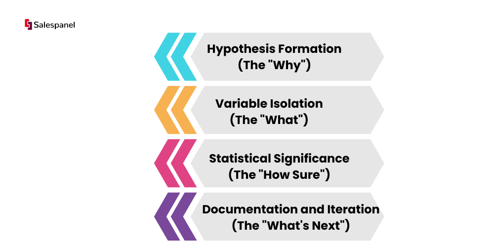
- Hypothesis Formation (The “Why”): Before you build any variation, state a clear, testable hypothesis. For instance, “We believe that changing the CTA button text from ‘Submit’ to ‘Get My Free Demo’ will increase form submissions because it frames the action around value for the user, not just data submission.”
- Variable Isolation (The “What”): Only test one significant element at a time. If you change the headline, CTA, and hero image all at once, you won’t know which change caused a performance increase or decrease.
- Statistical Significance (The “How Sure”): You need to run the test to a point where you can say, with a target confidence level (usually 95% or more), that the result isn’t random. Ending a test too soon can lead to false conclusions.
- Documentation and Iteration (The “What’s Next”): Meticulously document the hypothesis with the variations, results, and insights of every test. It serves as a repository of knowledge to prevent re-testing old ideas and notifies you as to future optimization strategies across all marketing campaigns.
Key Takeaway: Focus your testing on the most impactful elements of your landing page first. Modifications on the headline, primary call-to-action, hero image, and even the length of the form provide the most significant shifts in conversion rates and quickest learnings on your conversion rates.
Practical Implementation: From Theory to Action
A great example is the 2008 Obama campaign, where the team conducted systematic A/B testing on different media (images vs. videos) and button text (“Sign Up” vs. “Learn More”). They optimized the media mix and text, resulting in a 40.6% increase in sign-up rates and an estimated additional $60 million in donations. This wasn’t a lucky guess; it was the result of a disciplined, data-driven process, not a lucky guess.
To get started on your own B2B landing pages, identify the single biggest opportunity for improvement. Is your bounce rate high? Test the value proposition. Is your form abandonment rate high? Test the number of fields or the CTA text. Use tools like Google Optimize or Optimizely to set up your test. Run it for an entire business cycle (e.g., two full weeks) to capture the variations in weekly traffic. This methodical approach is one of the most important best practices for landing pages. It replaces assumptions with empirical data, making sure improvements are always made.
7 Key Landing Page Best Practices Comparison
| Item | Implementation Complexity | Resource Requirements | Expected Outcomes | Ideal Use Cases | Key Advantages |
|---|---|---|---|---|---|
| Clear and Compelling Value Proposition | Moderate (requires audience insight and refinement) | Marketing expertise, copywriting skills | Immediate visitor attention, lower bounce rates, higher conversions | Early visitor engagement, homepage hero sections | Captures attention fast, sets clear expectations |
| Single, Clear Call-to-Action (CTA) | Low to Moderate (design and placement focus) | Design resources, A/B testing tools | Increased conversions, focused user journey | Conversion-focused landing pages | Eliminates decision paralysis, easy performance tracking |
| Mobile-First Responsive Design | High (requires adaptable design and thorough testing) | Development time, device testing | Better UX on all devices, improved SEO, and higher mobile conversions | Sites with significant mobile traffic | Future-proofs UX, improves rankings and conversions |
| Social Proof and Trust Signals | Moderate (content gathering and placement) | Content creation, management, and updates | Increased credibility, reduced buyer anxiety, boosted conversions | Risk-averse audiences, complex purchase decisions | Builds trust, provides social validation |
| Minimal and Focused Design | Moderate (requires careful content prioritization) | Design expertise, usability testing | Reduced cognitive load, faster loading, focused user attention | Simple messaging, mobile, and speed-sensitive pages | Less distraction, better focus on key CTAs |
| Fast Loading Speed Optimization | High (technical skill required for optimization) | Developer expertise, monitoring tools | Higher conversions, improved SEO, lower bounce rates | High-traffic pages, mobile-heavy audience | Improves UX and rankings significantly |
| A/B Testing and Data-Driven Optimization | High (requires traffic, tools, and statistical analysis) | Analytics tools, traffic volume, expertise | Data-driven improvements, continuous optimization | Ongoing optimization, mature marketing teams | Removes guesswork, measurable ROI improvements |
From Principles to Pipeline: Activating Your Landing Page Strategy

You have worked through seven foundational pillars of high-converting landing pages. From crafting the value proposition to the never-ending optimization through A/B testing. These pillars are not items on a pre-launch checklist. Together, they formulate a holistic framework for building digital encounters with your B2B users. The common thread that connects these practices together is the focus on user-centric design and data-driven iteration to implementation.
The main focus is to eliminate friction. Every detail on the page, from the headline to the bottom CTA, must accomplish the same goal. That goal is to answer the question, “What is in it for me and how to get it easily?” A cluttered design, slow load time, or confusing call-to-action creates friction and ultimately results in a lost conversion. By targeting a single objective, utilizing social proof, and providing a seamless mobile experience, you remove the obstacles that stand in the way of a visitor and a possible customer.
Key Takeaways for Immediate Action
To go from theory to results, focus on these takeaways:
- Clarity Over Cleverness: Your value proposition needs to be communicated within five seconds. If a visitor must think hard to understand what you provide, you have already lost them.
- One Page, One Goal: Don’t try to ask for multiple actions. One focused call to action (CTA) aligns user intent with your main conversion goal, whether that be a demo request, content download, or trial sign-up.
- Trust is a Non-Negotiable Asset: In the B2B space, trust is equivalent to currency. Testimonials, client logos, and security badges are not just for design. They are crucial elements that build trust and mitigate risk.
- Optimization is a Process, Not a Project: The best landing pages are never “finished.” They are dynamic, created to evolve based on A/B testing and performance analysis. What works today doesn’t mean it will work in the future. Continuous optimization is necessary to stay ahead.
Beyond the Page: Connecting Clicks to Customers
Implementing these landing page best practices is just the starting point. But true competitive advantage in B2B marketing lies in understanding the “who” behind each click. A technically well-designed landing page that generates anonymous conversions is only the beginning. The rest involves identifying high-value prospects and enabling your sales team to engage them at the right moment.
This is where the Martech stack becomes a strategic enabler. Beyond tracking conversion rates, it is useful to connect on-page behavior with firmographic data. With a solution that identifies visiting companies and scores their engagement, you can turn your landing page from a passive lead capture form into an active pipeline generation into an active pipeline generation engine.
Take, for example, Salespanel, which offers a lead scoring framework. It can track visitor activity and identify the companies they represent, and score the leads based on time spent on the website and pages viewed. This enables your sales team to engage leads who are ready to convert, even before form completion. By combining the best practices for landing pages with this layer of intelligence, you don’t merely gather leads; you initiate meaningful sales conversations and create a direct, measurable impact on revenue.
This guide provides the blueprint for building effective landing pages. Your success will be defined by your commitment to continuous testing, your focus on the user experience, and your ability to connect actions on the page to your sales and marketing pipeline. The iterative process of build-measure-learn will help transform each of your landing pages into a powerful business growth engine.
Ready to uncover the high-intent accounts visiting your newly optimized landing pages? Salespanel recognizes anonymous site visitors and tracks their buying signals so that your sales team can interact with qualified prospects in real time.
Sell more, understand your customers’ journey for free!
Sales and Marketing teams spend millions of dollars to bring visitors to your website. But do you track your customer’s journey? Do you know who buys and why?
Around 8% of your website traffic will sign up on your lead forms. What happens to the other 92% of your traffic? Can you identify your visiting accounts? Can you engage and retarget your qualified visitors even if they are not identified?